Core Block
Specimens
Every block an operator can reach from the inserter, rendered in Kyber Hull and stacked in families. One scroll, one sign-off. The labels are workshop annotation — the specimens are the content.
ConfirmThis sheet is set in Space Grotesk and Manrope, because the styleguide names them and the styleguide is the source of truth for fonts. The shipped theme is set in Orbitron and Onest, and the live Content Guide copy refers to “the Orbitron display-font ladder”. One of the two is stale — resolve before conversion, or every type value on this page lands on the wrong faces.
Type, set on the hull.
The heading ladder, body copy, lists, both quote blocks and the three monospaced blocks. Space Grotesk carries every heading and label; Manrope carries every reading line.
10 specimens
All six levels ship the same class, so the ladder is expressed by tag alone. h1 and h2 take chrome-highlight because hero-scale titles are where light physically falls; h3–h5 step down to chrome-warm; h6 cools to chrome-dim micro annotation. The ember light-hit above h1/h2 is a pseudo-element — no DOM added.
Every character, every core
Hundreds of sabers, one retailer
Choosing between Xenopixel and Proffie
What the duelling grade actually changes
Blade fitment and flex
Workshop note
Body copy at 16px / 1.55 in chrome-warm, capped to a 68-character measure. Bold lifts to chrome-highlight — emphasis reads as a light-catch rather than a weight change alone. Inline code becomes an ember-tinted chip; prose links keep the ember hairline underline that the data widgets below deliberately drop.
A saber arrives seven to ten days after you order it, direct from the factory floor. We are straight about that window because the alternative is pretending a warehouse exists where one does not. What we will claim is the catalogue: around 350 saber models across 1,100 variants, every Saber Core tier, every duelling grade.
Every powered core ships with a charged cell and a USB-C lead in the box, and the XenoConfigurator app pairs over Bluetooth on iOS and Android — see the Saber Core comparison if you are cross-shopping tiers, or flash a config yourself with ProffieOS if you would rather build the sound font from scratch.
Three attributes the editor writes onto the same paragraph class. The drop cap takes ember-glow with a soft bloom — forge light landing on the first letter. The two size presets shift scale and tone together so the operator can see which one they picked.
Before you ignite a fresh build for the first time, run the bench list a workshop tech would run: charge the cell fully, seat the blade, check the flex, then power on away from your face. Five minutes now saves a returned core later.
The heading step — for a standfirst, or the opening line of a workshop announcement that needs more weight than the copy around it.
The small step — fine print, secondary notes, and anything that should not compete with the reading column.
The li carries no class of its own, so both markers are drawn with pseudo-elements: an ember square for bullets, tabular ember numerals for ordered lists. At the nested level the bullet cools to a hollow chrome square and the nest sits behind an ember-dim rule, so hierarchy reads structurally rather than by indent alone.
- Baselit RGB-X Core — infinite blade colours, Bluetooth as standard
- Xenopixel V3 Core — 30+ sound fonts and pixel-strip depth
- SNV4 PRO Core — the duelling collector's default choice
- Proffie 2.2 Core — the top tier for fully custom builds
- Unbox and inspect the hilt for transit damage
- Charge the cell fully before first ignition
- Pair the app over Bluetooth and flash the latest firmware
- Run the blade-flex check before any contact drill
- Saber Cores
- Xenopixel V3 — pixel, 30+ fonts
- Proffie 2.2 — programmable, unlimited fonts
- Hilt finishes
- Brushed chrome
- Weathered carbon
- Pre-flight
- Charge the cell
- Flash firmware
- First ignition
- Confirm blade seating
- Power on away from the face
Carries the brand's existing attributed-quote treatment across to the core selector: a 3px ember edge, an ember wash falling away to the right, and an ember cast to the left of the plate. The cite has no class, so it is reached as a descendant and takes the em-dash-in-ember convention.
You do not choose the blade. The blade chooses the hand that carries it.
The workshop had been quiet all evening. Cassian worked the last bead of solder into place with the patience of someone who no longer noticed the passing of hours, only the changing pitch of the coolant hum behind the bench.
The Fragments of Cassian, unnumbered
A recessed plate framed top and bottom by ember hairlines — the seam signature at component scale. Deliberately centred and display-set so it can never be mistaken for the left-edged quote above it.
A saber-smith who hoards his own work has forgotten who the myth belongs to.
Founder's note, 2020
Three pre blocks that must never look alike. Code is a recessed plate with an ember left edge and an ember legend tab sitting on the top edge — the brand's legend-breaks-the-border move, drawn with a pseudo-element. Preformatted is the data register: a raised plate, chrome edge, tabular figures. Verse is editorial and therefore takes the body font, not mono.
.saber-core {
  sound-font: xenopixel;
  blade-colours: 16700000;
  duelling-grade: heavy;
}
HILT CORE BLADE
Anakin EP3 Xenopixel V3 36in RGB
Weathered Maul Proffie 2.2 2x 32in
Kanan Jarrus SNV4 PRO 36in RGB
A blade is not a weapon
until the hand that holds it
knows why it was lit.
ConfirmThe styleguide names no monospace family. Code and preformatted use a neutral system mono stack, framed in brand chrome so they still read Kyber Hull. If a licensed mono is wanted, name it and the two blocks inherit it with no other change.
Real MathML, not an image — which means its parts are individually styleable. Identifiers take chrome-highlight, numerals take ember-glow with tabular figures, operators take ember. The result reads as brand-native without any custom rendering.
DOM flagWanted the LaTeX source as a caption beneath the expression. It sits in <annotation> inside <semantics>, which browsers hide and CSS cannot reposition. Needs a custom block or a render filter, not CSS.
Media in its plate.
Four of the six blocks flagged as unstyled live here. Every media block becomes a plate: recessed ground, one chrome hairline where the raised lip catches light, and a deep cast beneath. Product crops are square, matching the catalogue's own photography.
8 specimens
The plate frame: recessed ground behind the crop, a single 1px chrome hairline along the top edge only — never a frame around all four sides — and a deep cast below. Full-bleed images close with an ember hairline, the light spilling from behind the plate.
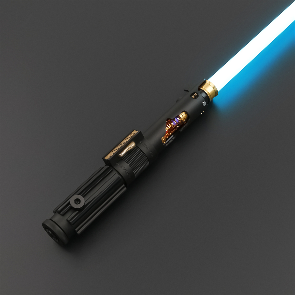
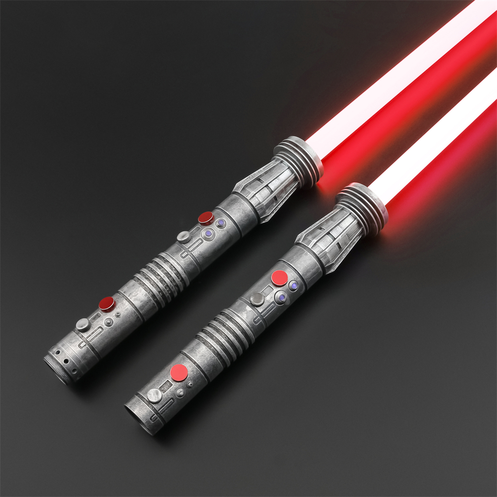
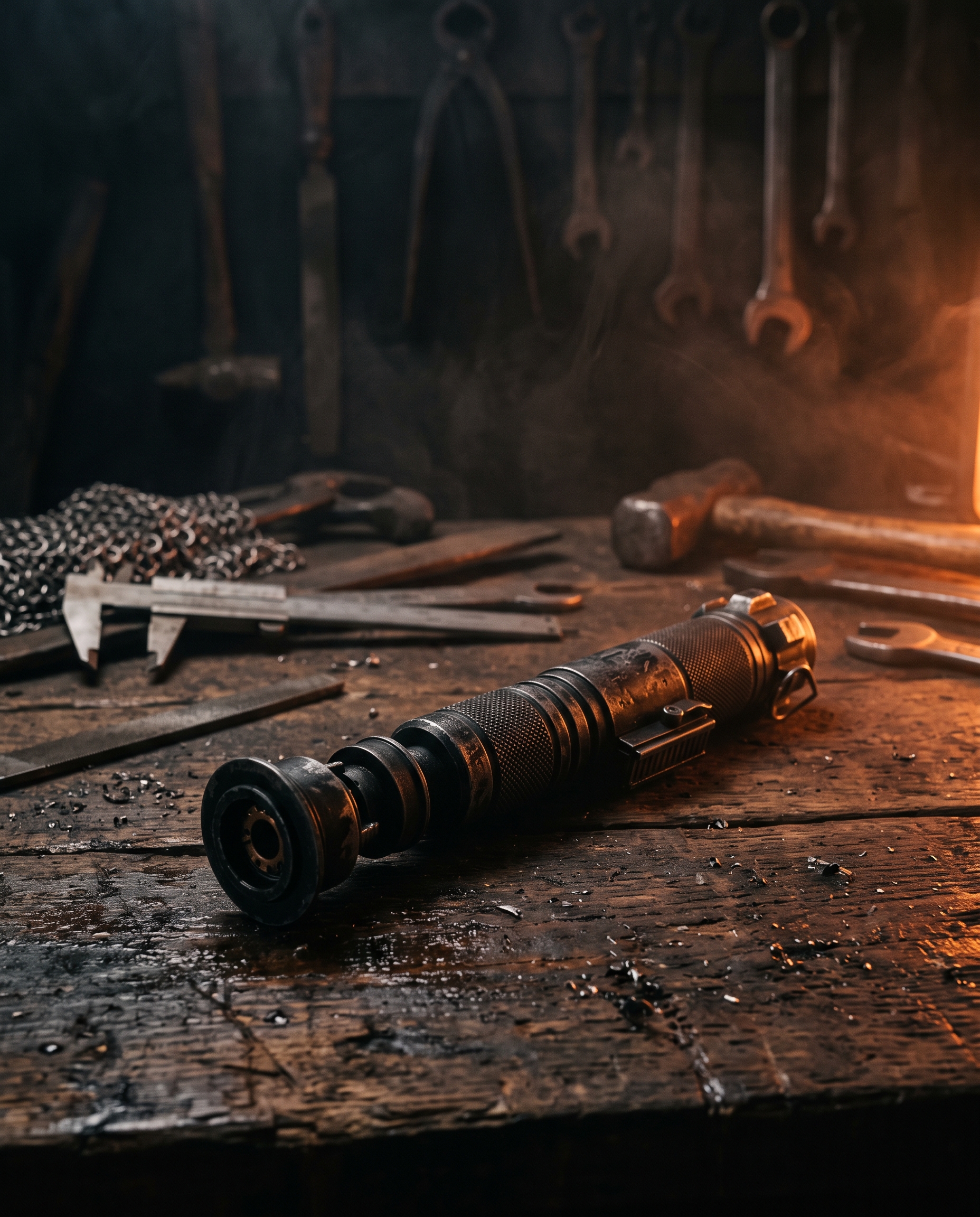
DOM flagCore ships two DOM shapes for one block: figure.wp-block-image for default/wide/full, but div.wp-block-image > figure.aligncenter when centred. The plate frame must be written against both — collapsing to one selector silently un-plates every centred image.
One selector covers image, gallery, columns-image, embed and media captions — so one treatment has to serve all five. Body font, italic, chrome-dim, sitting inside the plate rather than floating below it, opened by a short ember hairline that echoes the eyebrow rule.
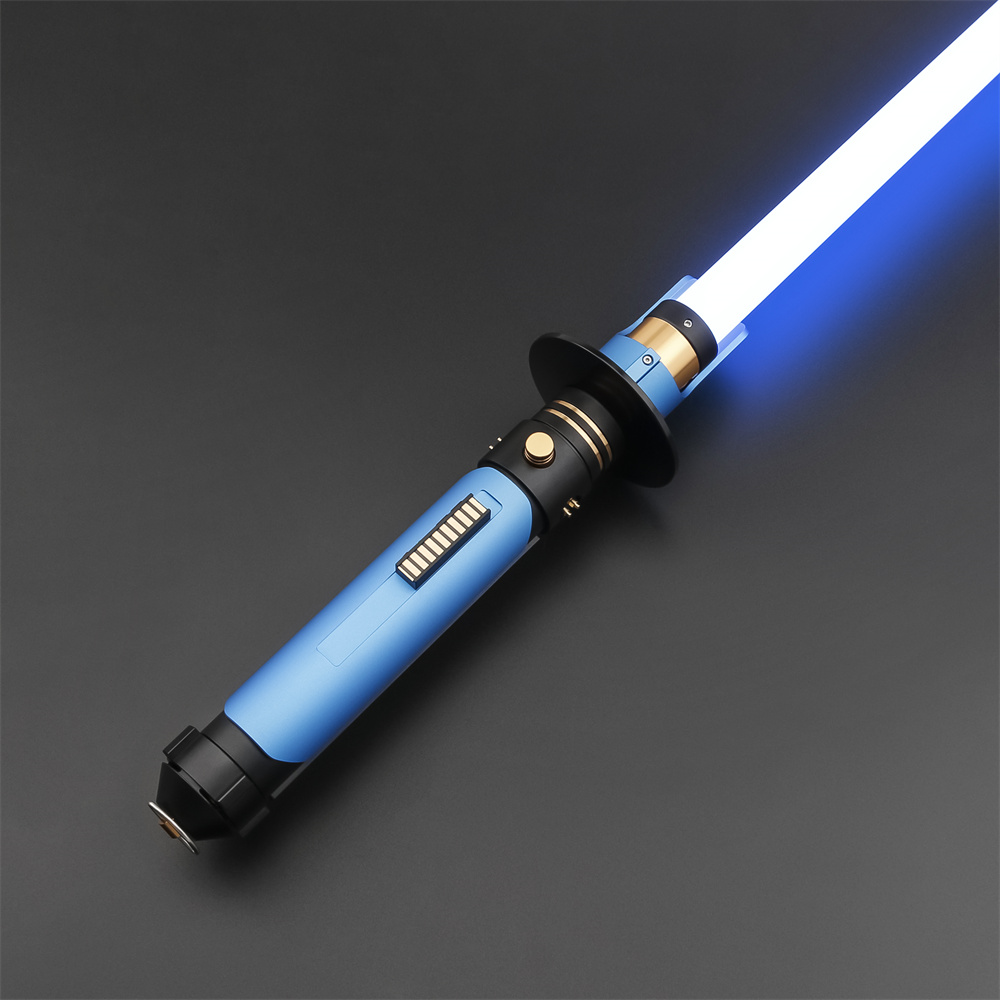
DOM flagThe brand's caption pairs an ember eyebrow word with a dim italic sentence, using two spans. Core emits one flat text node — no second element to tint. Built instead: a short ember hairline opening the caption, carrying the same signal. Two-tone captions need a custom caption block.
Currently unstyled. Treatment: the gallery stops being a row of separate framed pictures and becomes one assembled plate array — 2px dark seams between square crops, a single shared chrome top-edge across the whole array, and the nested images giving up their own frames so nothing double-plates. Each crop lifts on hover with an ember hot-rim, the object still warm from the forge. columns-2 and columns-3 are core-emitted classes, so they are legitimate styling hooks.
Currently unstyled. Treatment: an aperture cut into the hull — a 4px recessed surround so the frame reads as a plate opening rather than a pasted rectangle, a chrome top-edge, an ember hairline closing the bottom, and a provider legend drawn from core's own is-provider-* class.
DOM flagThe iframe is cross-origin, so the cinematic grade applied to every other image stops at the plate edge — a bright thumbnail will always sit hotter than the hull around it. Accepted here. A click-to-play poster frame would need a custom block.
Currently five declarations. Treatment: the strongest brand move on the page after the section seams — the two halves butt together with no gutter and an ember hairline runs the join, the panel-seam signature at component scale. Asymmetric 5:7 split so it reads as a spec-sheet pairing rather than a 50/50 slab; the seam moves with the media when the operator flips it right.
The SNV4 PRO sits where most collectors settle: reinforced hilt, eighteen sound fonts, twelve blade colours, and a duelling grade rated for direct contact. It is the core we recommend when someone tells us they want one saber rather than three.
Flip the media right for the second block in an alternating run, so the eye zig-zags down the page instead of reading two left-aligned crops in a row. The join seam follows the media — the light always spills from the plate edge, never from the middle of the copy.
Currently two declarations. The dim layer is a span sibling of the image, not a pseudo-element — so rather than fight it, the treatment restyles it into the design brief's 62 / 72 / 88 percent dark stack plus a corner ember bloom. Chrome top-edge on the plate. No hero-bottom ember overlay: the brief bans it because it doubles with an adjacent panel seam.
Built for the bench
Every core is flashed, tested and duel-checked before it leaves the workshop. If something goes wrong afterwards, one named person answers you.
DOM flagThe dim span and the background img swap sibling order between instances — span-then-img on a default cover, img-then-span on the category-tile variation. Both verified in the live render. Depth must be set by explicit z-index, never by source order or sibling selectors.
How the plates assemble.
Columns and group are the two blocks an operator reaches for most and the two with the least design. Both get the construction story: you can see the joint, and the joint is a hairline — never a border box.
7 specimens
Currently one declaration. There is no column-count modifier in the emitted markup, so the treatment has to hold at any count. Chosen: a vertical joint hairline between columns, negative-margin-matched to the gap so the rule sits exactly on the join. Two-up and three-up below are the same CSS.
Collectors
Display builds and completionism. The premium tiers, the exclusive designs, and the hilts that only make sense on a stand.
Duelists
Heavy-grade builds and reinforced hilts. Rated for direct saber-on-saber contact, checked on the bench before dispatch.
DOM flagWanted each column as a raised plate with a chrome top-edge — what an operator building a three-up feature row expects. Not built: .wp-block-column also wraps bare prose columns where a plate is wrong, and core emits no modifier distinguishing the two uses, and no column-count modifier at all. Fix: register a core/columns style variation (e.g. is-style-plated) and hang the plate off that.
Currently one declaration. The consequential fact is the inner container: children nest one level deeper, so every interior rule reaches through it. A plain group stays invisible — it is a layout primitive. A group with a background becomes a raised plate carrying the brand's boxed-content treatment: 3px ember edge, chrome top hairline, ember bleed down the edge. Operator padding from the Dimensions panel arrives inline and correctly wins.
A plain group with 48px of padding from the Dimensions panel. No fill, no edge — grouping is structural here, and the theme stays out of the way.
What happens after you order
Your build goes to the bench, then to hand-testing, then to dispatch. You get a named single point of contact from the moment the order lands — not a ticket queue. If something goes wrong, we are still here.
DOM flagThe design brief mandates the legend-breaks-the-border treatment for every bordered content group. Core/group emits no label element, and a pseudo-element cannot read operator text. Fix: a custom content-group block with a legend field — core/group stays the unlabelled variant.
The default takes the brand's ember hairline: transparent at both ends, ember-glow at the centre, soft bloom beneath. Wide runs the full container. Dots re-tint core's own glyph mechanism to ember. The registered is-style-wide “Hairline rule” is deliberately the quiet one — a chrome hairline with a single ember dash at the left end, the rule that opens a spec strip rather than a decorative divider.
Deliberately untouched. The inline height is the operator's instrument and the theme must not override it — the only declaration applied is display: block so it survives inside a flex parent. The paragraph below sits 60px down.
Sixty pixels of deliberate silence above this line.
Interactive surfaces.
Buttons, both accordions, search and file. Every focusable element takes an ember focus glow — a blue browser default focus ring is banned brand-wide, and that ban is enforced here in the base layer, not per component.
6 specimens
The default is the styleguide's primary CTA: a three-stop orange ombre from forge-glow through ember to smouldering-deep, burnt-black text, and an outer ember glow that reads as heat radiating from a still-hot ingot. Hover intensifies the halo and lifts a pixel.
ConfirmButton letter-spacing is set to 0.06em because the styleguide states it twice for CTA text. Every shipped button in the brand's reuse catalogue uses 0.14em. The two are visibly different at 13px. Confirm which is canonical — the mockup follows the styleguide.
Decision: share the geometry and the type, diverge the fill. All three take Space Grotesk, uppercase, zero radius and the same padding rhythm, so they read as one family. Only the button block earns the ombre gradient — a search submit and a file download are utility affordances, and giving them a full CTA fill would let a search box out-rank the page's actual conversion action. Those two take the brand ghost recipe instead.
The styleguide's input law: underline only, no box. Bottom border sits at outline-variant and transitions to ember on focus with an ember glow beneath — never a blue ring. The label sits above in uppercase display micro-type, matching the brand's form-label convention. Focus the field to see it.
Reproduces the brand's dotted-leader spec row — label left, action right, dotted leader running between — entirely from the filename anchor's own pseudo-elements. An ember tick opens the row; the leader is the anchor's ::after. No element added, and the row reads as a spec pair rather than two loose links.
The summary carries no class, so the whole row is built from it: a three-column grid where the ember index numeral and the toggle glyph are both pseudo-elements. The index is CSS-counter-driven, which reproduces the brand's Q.01 numbering without adding markup — note the counter must be reset on the content wrapper, not the body, or it runs across the page.
Do your sabers ship with batteries?
Yes — every powered core ships with a charged cell and a USB-C charging lead in the box.
Can I swap the sound font later?
On a Xenopixel or Proffie core, yes — over thirty fonts, swappable from the app over Bluetooth.
Decision: converge the vocabulary, diverge the register. Two accordions that look unrelated on one site is a defect; two that look identical make the native block pointless and invite operators to pick the wrong one. So the native block shares the material, the ember index, the glyph family and the open-state lift with the hand-rolled FAQ component — but it is a continuous butt-joined stack (no gaps, no per-item cast shadow, one shared chrome top-edge) where the FAQ component stays discrete floating cards with 12px gutters. Same language, different sentence: the native block is for an accordion inside prose, the FAQ component is for a page section. First item shown open.
Seven to ten days worldwide, factory-direct and tracked the whole way. We do not quote faster than we can build.
A named single point of contact, assigned when your order lands, with a first response inside 24 hours.
DOM flagThe toggle glyph is a text node (+), not an SVG — CSS cannot rewrite it. The open/close swap is done by making the span transparent and re-drawing the glyph as a pseudo-element keyed to [aria-expanded="true"]. It works and stays accessible, but it is a text-hiding trick: if core ever ships an SVG here, swap to a rotate and delete it.
Widgets read as instruments.
These eight blocks currently inherit prose link styling — ember and underlined — which renders as an undifferentiated wall of links. One governing decision fixes all of them: leave the prose register entirely and adopt the brand's HUD micro-type. Display font, 11–12px, uppercase, wide tracking, chrome-dim at rest, no underline. Ember is reserved for hover, current-page and numerics.
9 specimens
The spec-sheet register the brand already uses for hilt specifications: header cells in ember uppercase micro-type over an ember hairline, body rows separated by dim hairlines rather than zebra fills, and tabular figures throughout. The first column takes the label treatment — body font, uppercase, chrome-dim — so a two-column table naturally becomes a spec-pair list.
| Saber Core | Sound fonts | Blade colours | App control |
|---|---|---|---|
| S-RGB | 8 | 12 | Yes |
| RGB-X | 12 | Infinite | Yes |
| SNV4 PRO | 18 | 12 | Yes |
| Xenopixel V3 | 30+ | 16.7M | Yes |
| Proffie 2.2 | Unlimited | 16.7M | Yes |
| Hilt length | 11.5 in (292 mm) |
| Blade length | 36 in (914 mm) |
| Weight | 410 g |
| Duelling grade | Heavy |
DOM flag“First column is the label side” is right for a two-column spec pair and wrong for a wide numeric table — core emits no class distinguishing the two shapes. Fix: a core/table style variation (is-style-spec) carrying the label-column treatment.
Editorial content, so titles stay display-set headlines rather than nav labels. The date ships after the title in the DOM; flex order: -1 lifts it into the eyebrow position above without touching the markup — a good example of a treatment reachable despite fixed source order.
-
Choosing between Xenopixel V3 and Proffie 2.2
Both are top-tier. They are top-tier at different things, and the deciding question is whether you want to write configs yourself.
-
What duelling grade actually changes inside the hilt
Reinforced blade retention, thicker polycarbonate, and a different failure mode. Here is what we check on the bench before dispatch.
-
Nine ARTSABERS Exclusive designs, and the stories behind them
Original hilts with invented histories — written in-house, built to the same spec as the character replicas.
A recessed plate of HUD rows. Top-level terms take chrome-warm uppercase display type over hairline seams; the nest indents behind an ember-dim vertical rule and drops to body font at lower emphasis, so two levels are legible without a single indent guess. Hover goes ember — the only place ember appears at rest is the tree rule.
Core writes an inline font-size in points on every tag — 8pt to 22pt here — as its only weight signal. The treatment works with that rather than against it: each tag becomes a chip whose padding is em-based, so the point range reads as deliberate chip scale instead of a ransom note. Hover fills with the ombre gradient, the one place a widget borrows the CTA fill.
Pixel Baselit Programmable By Character By Era Jedi Prequel Trilogy Anakin Skywalker Darth Maul Sith By Saber Core
DOM flagThe inline point size is core's only weight signal, and CSS can only override it with !important — which throws the weight information away. Treatment authored to read across the full 8–22pt range instead. Real fix is a wp_tag_cloud args filter in PHP (smallest / largest / unit), not CSS.
HUD rows with a dotted leader running to the right edge — the same leader mechanism as the file block, so a date list and a spec row share one visual grammar. Tabular figures keep the months in column. The empty state ships as a div carrying the same classes, so it is styled too.
Deliberately not a tree: a flat two-column HUD grid, so it can never be mistaken for the categories widget above. Each row opens with a dim square tick that ignites ember on hover; the current page keeps the ember tick lit and lifts to chrome-highlight.
Decision: work with core's per-service SVG rather than replace it. Core injects each service's own path, and fill: currentColor hands the brand complete colour control — so a custom block would buy nothing but maintenance. Each becomes a 46px square plate at zero radius with a chrome top-edge; hover lifts it and fires the ember hot-rim.
The one widget in this family whose content is genuinely editorial, so titles stay sentence-case headlines while the date carries the HUD register — mono, tabular, wide-tracked, right-aligned in its own column. That split is what stops a feed reading like a nav list.
Carries the brand's existing breadcrumb treatment across almost unchanged: display font, 11px, 0.14em tracking, uppercase, links chrome-dim going ember on hover, current page chrome-warm. The separator glyph arrives as an inline --separator custom property, so it is honoured rather than hard-coded — the operator sets it on the block.
The twelve registered.
All twelve currently render as the plain default. Each is shown here against that default so the difference is legible at a glance — if an operator cannot tell from the rendering why a variation exists, it has not earned its slot in the Styles panel.
15 variations · 6 paragraph · 6 button · 2 image · 1 separator · 1 cover
DOM flagWordPress appends a per-instance numbered twin to any variation registered with style_data — the live render shows is-style-outline--3 and is-style-category-tile--9. Style the base class only; the numbered twin changes per instance and must never be a selector hook.
Six jobs, six registers: eyebrow is display micro-type in ember opened by a hairline; lead is body copy at subheading scale and mid weight; price is display tabular in ember at 28px; meta-name and meta-value are the two halves of a spec pair; mono-date is the timestamp stamp, mono with an ember tick. Default paragraph shown first for comparison.
Default paragraph — body copy, chrome-warm, 16px on a 68-character measure.
ARTSABERS Exclusive
Hundreds of sabers, one trusted retailer — every character, every Saber Core, every duelling grade, shipped direct from the factory floor.
$404.99
2026-08-06
DOM flagThe brand's canonical spec row is label left, value right, dotted leader between — one row. These two variations are sibling paragraphs, so in flow they can only stack. Built the nearest thing: meta-name carries the leader to the right edge, so the pair still reads as a pairing. The true row needs a core/columns wrapper or a custom spec-row block.
Four buttons, settled 2026-08-06. Six brand fills were registered and rendered here together; a single-hue palette cannot carry six legibly distinct fills, so the set was cut. Three axes do the work across four: fill (ombre / dark / none), edge (none / ember hairline) and halo (medium / none).
ResolvedFour buttons, settled 2026-08-06. Six brand fills were registered and rendered here together, which is what settled it: a single-hue palette cannot carry six legibly distinct fills. Retired — ember and ember-glow were both restatements of the ombre the default already is, and ember-glow could only differ by halo intensity, visible side by side and invisible in isolation; clear and ghost-ember-glow were a fourth and fifth point on an axis with room for two. The registered set is now dark + ghost-ember; the default and core’s outline need no registration, so the Styles panel offers exactly these four.
Two clearly separate jobs. Showcase is the editorial hero plate: 16:9, a chrome glint gradient across the top edge, an ember hairline closing above the caption, and the deeper cinematic grade. Tile is the compact catalogue crop: square, brighter grade, plate lift, and a caption that becomes an uppercase tile label rather than an italic sentence. Tile lifts and fires an ember hot-rim on hover; Showcase does not move, because an editorial image is not a link.

Registered for the “rule above a spec strip” case, which is structural rather than decorative — so it is deliberately the quieter of the two. Full container width, a chrome hairline rather than an ember one, and a single ember dash at the left end to mark where the strip begins. Default shown above it for comparison.
A navigational image-with-label tile for category grids, taking the brand's faction-tile vocabulary: movie-poster 3:4 proportions on the deep-recessed ground, the scrim weighted to the bottom so the label always reads, the heading pinned bottom-left at display scale, and an ember right-edge glint that ignites on hover. Note the variation's style_data sets the text colour, so the inner heading inherits chrome-highlight without a descendant cascade.
Lightsabers
Cosplay Helmets