CamCom Blocks
Table of Contents
The following is a demonstration of all the bespoke CamCom blocks that have been developed, with instructions on usage. This will be kept up to date as blocks are modified and new blocks are developed.
The following is a demonstration of all the bespoke CamCom blocks that have been developed, with instructions on usage. This will be kept up to date as blocks are modified and new blocks are developed.
Product Promo CTA
This is the Card Title

This is the Product Title
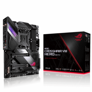
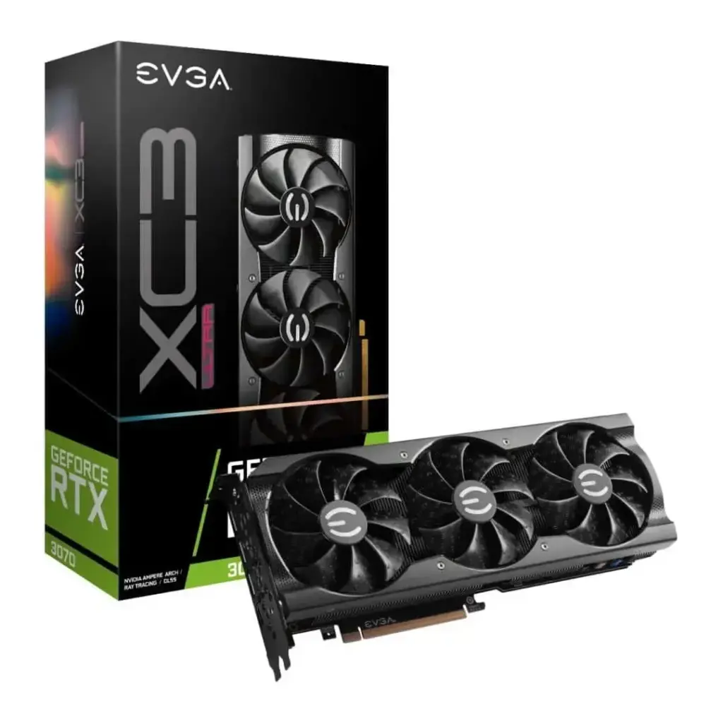
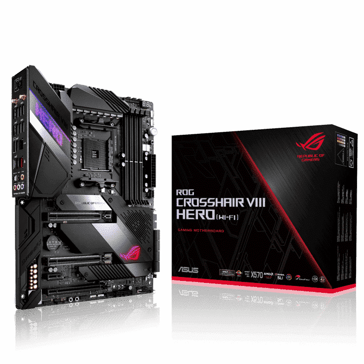
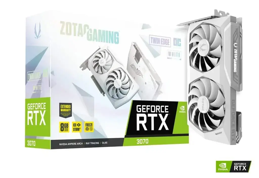
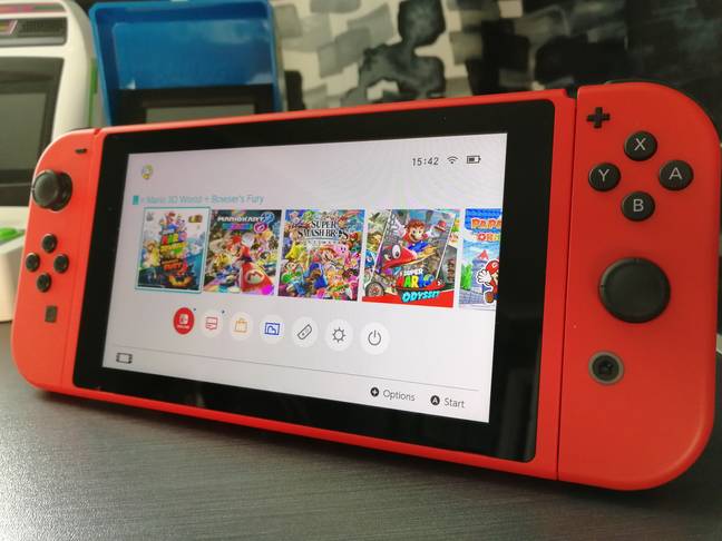
This block comes with a card component background built in, as well as a banner title. The card title, product title & description, image, link and link button text are all editable. The link button will only appear if there is a URL saved.
Button TextMedia & Text Promo

This is the content title
This block is designed to be completely customisable. It must use a poster style image, as demonstrated, so it fills the left side of the block.
Price is not prefixed with a currency symbol – so it will need adding.
To add – an option to select a product which will automatically pull in the price and URL. Meta Price field will then be removed as an option.
Pre-Order Showcase
The Banner Title requires adding a heading block, with the banner title rules applied. The Pre-Order Showcase does not natively have a background and requires the CSS class .card to be added as an Additional CSS Class to provide the background unless in a block group with a background applied.
Featured Pre-Orders
Product Carousel
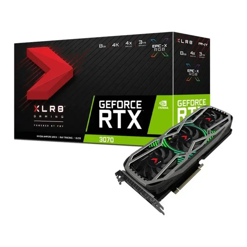
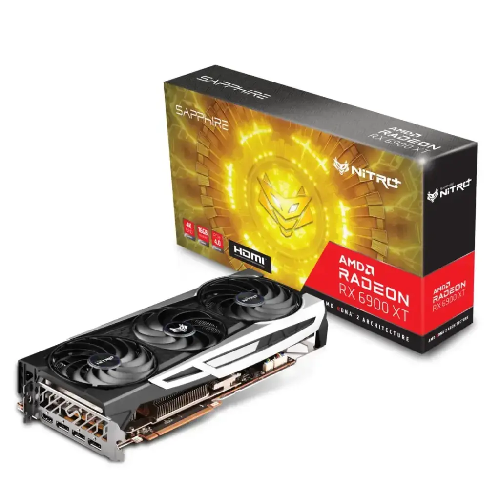
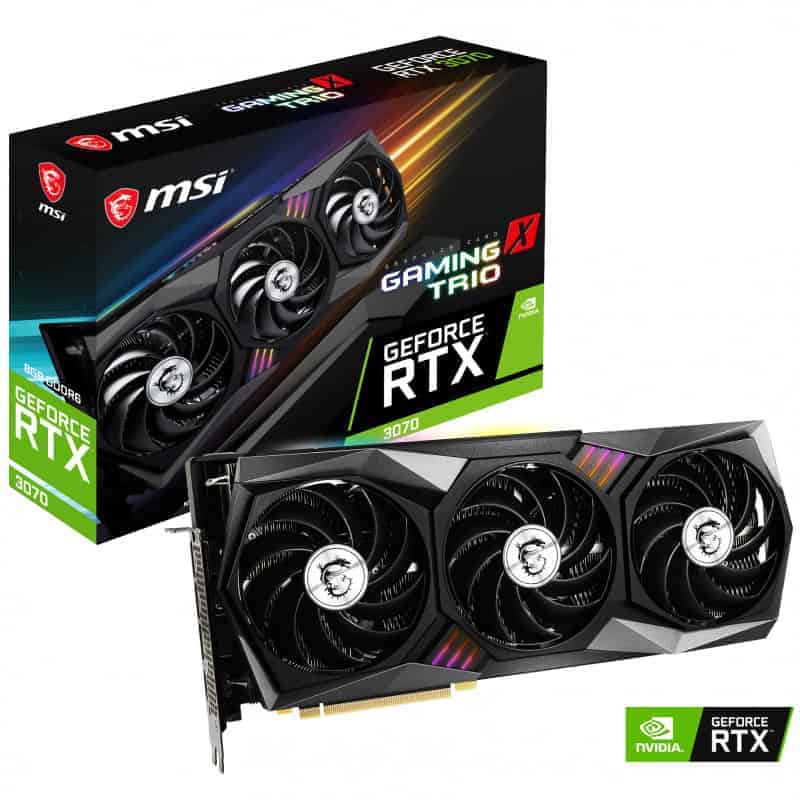
The product carousel has the option to pick product categories & limit how many posts will appear in the carousel. It does not natively have a background so it can situated alongside other blocks, such as paragraphs.
It requires being wrapped in a group or the card CSS class being added to it. The first carousel is wrapped in a block group. The second is a standalone block with card added as an ADDITIONAL CSS CLASS via the block options in the sidebar.
Various options will be added to the carousel setup – newest products, best sellers & product recommendation plugin generated sets.
Link Box
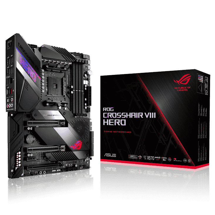
Link Boxes are best used in a column layout as they will fill what available width there is, and maintain a 1:1 aspect ratio so they can grow to be very big.
Link Cards
Link Cards are best used in a column layout as they will fill what available width there is, and maintain a 1:1 aspect ratio so they can grow to be very big.
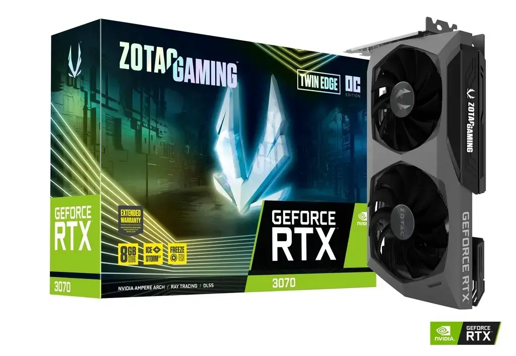
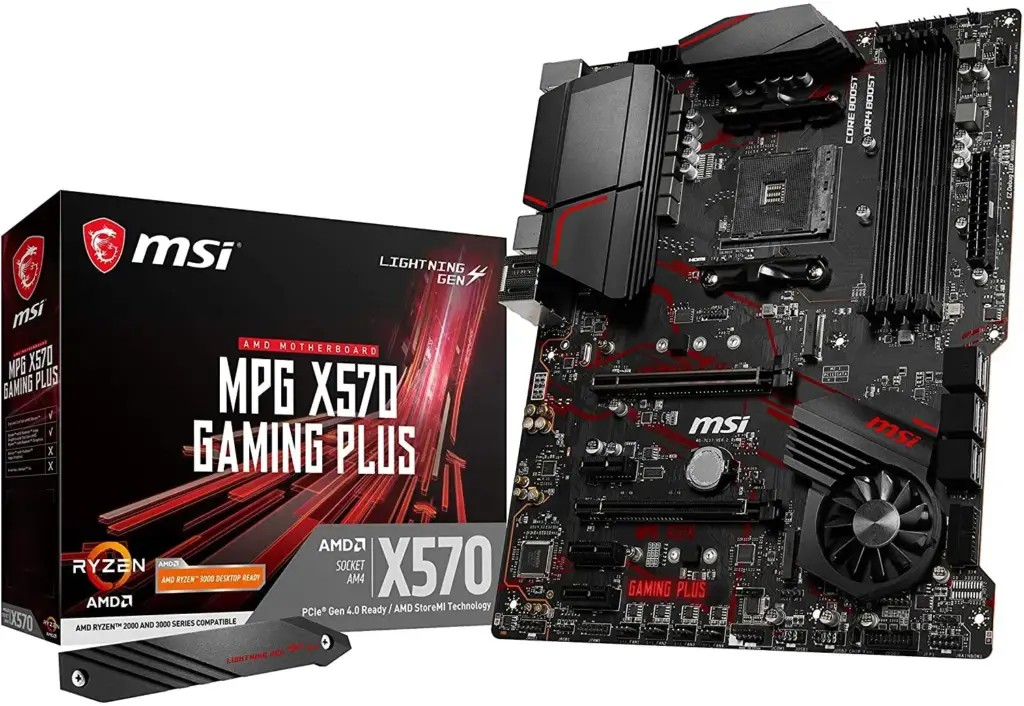
Link card images have a white background set by CSS so an image with a transparent background will be set on white to fill the link card image box.
